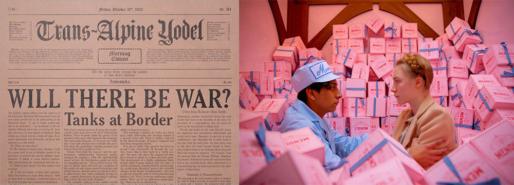
1) The Grand Budapest Hotel
Let’s get the Wes Anderson film out of the way. Of every Wes Anderson film I’ve seen, Grand Budapest is my favorite for design because of one thing: Typography. Annie Atkins was the lead graphic designer for the film and is responsible for all the instances of gorgeous typeface we get to enjoy. Since the world of Grand Budapest is entirely fictional, things like businesses, newspapers, crests, and even postage stamps were all created from imagination. The cake boxes from Mendl’s Patisserie were all screen-printed, telegraphs were typed on a vintage typewriter, and Anderson himself wrote each article found in the Trans-Alpine Yodel (look at that beautiful Y!). The fact that nearly every instance of a business or government establishment was created and designed from scratch is why Grand Budapest makes this list despite my distaste for clichés. You can read more about Atkins’s experience with Grand Budapest here.
2) Scott Pilgrim vs. the World
Edgar Wright is, of course, a pro at visual comedy and each joke thrown in is very specifically and meticulously designed. Much like design, visual jokes are designed to look casual and under the radar. A logo, for example, is supposed to seem very natural with a sort of “yeah, why wouldn’t it look like that?” effect. Like the Nike swoosh. Similarly with a bit like this one with Audrey Plaza breaking the fourth wall. Why wouldn’t the joke work like that? It makes perfect sense and fits the scene seamlessly.
3) Eternal Sunshine of the Spotless Mind
From a Design perspective, Eternal Sunshine’s charm is a bit more subtle. Most of the movie is shot in a pretty muted color palette and sometimes having a Chiaroscuro effect by shooting in the dark with flashlights pointed at the actors’ faces. This helps to create an unsettling passage between memory and reality that the viewer is continually moving through. The few moments of good, rich color often occur when Kate Winslet comes on the scene with green, blue, or electric red hair. Attention-grabbing elements like bright color or bright light can disrupt a pattern or provide a focal point for a piece. This was a regular technique used in Swiss design decades ago and we’re still taking cues from it today.
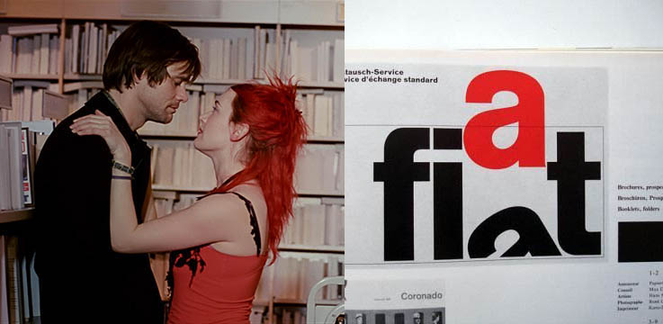
Where does your attention lead to?
4) Coraline
Now, in my opinion, all stop-motion films are amazing if nothing else because of the sheer time and dedication they take to execute. Coraline is no exception. I find much of the design perspective is finding a balance between having the carefree creativity of an artist and the meticulous detail of an accountant. A stop motion film like Coraline is a perfect example of this kind of balance. There’s a clearly-defined style that’s found in things like the spindly limbs of plants, characters, and architecture; the vibrant glowing creatures that give you a sense of wonder and unease; the expertly-chosen color palettes in the two worlds we encounter; and the comic disproportions of the people we meet. To not only have that style but carry it out with the most painstaking designs is something every designer can take note of.
5) Fight Club
Fight Club is another movie I feel a bit cliché for including. This was, of course, one we watched in my film classes. In my design classes, we learned about a thing called “gestalt” which is “an organized whole that is perceived as more than the sum of its parts.” An example of this would be the USA Network logo. There’s not actually an “S” in the logo, but it’s perceived and understood anyways. There’s a gestalt-like feeling at the beginning of Fight Club when looking from a design perspective. In a similar fashion, the movie points to something that’s not really there through subliminal messaging and clever scripting.
See the S? Is it really there?
6) Finding Nemo
Alright, so Finding Nemo is placed here a bit superficially. While there is something to be said for picking the perfect color palettes (yum!) and showing the texture of ocean water in light reflecting off tiny particles, Finding Nemo is really just a visual feast for your eyes as far as a design perspective is concerned.
7) The Fall
The Fall is actually my favorite movie so it’s hard to not have this one on the list. One of the reasons being the costume design. You know a movie is going to be fun when Charles Darwin is wearing an oversized red fur coat and a bowler with literally no explanation. It’s also a visually stunning movie. The film was shot in 28 different countries (65 specific locations) over the course of 4 years and each scene is expertly staged and could be a gallery-worthy photo with ease. The amount of thought, design, and labor that went into this movie is an inspiration for any photographer.

Very specific placement of objects and characters with a beautiful backdrop.
8) The Artist
A good designer seeks to be innovative. The Artist was innovative in that it presented a plot about a silent film star via a silent film! And, remember, this movie came out in 2011. It had been a while since a feature-length film was black and white let alone silent. This allowed the movie to focus on the talents of the protagonist. He entertained his audience both in and outside of the movie in the exact same way which, from a design perspective, is an ingenious way to accomplish two tasks.
9) The Secret of Kells
This movie has the most delicious use of pattern and visual rhythm. The art style is inspired by the Book of Kells so everything fits together like a detailed puzzle while also incorporating non-traditional perspectives that are almost Picasso-like. This helps to emphasize the book itself and the importance of its beauty.

Beautiful patterning found in the secret of kells and the book of kells
10) Spirited Away
Studio Ghibli films are always a feast for the eye due to the visually striking scene settings and creativity of characters. While a design perspective is usually one of “simple is best” solutions, Spirited Away teaches us that it’s sometimes ok to break the rules. Many scenes are filled with clutter, crowds, and an almost overwhelming amount of detail and yet it’s incredibly satisfying to watch. This is because, as with all design, there’s a balance between extreme clutter and peaceful order.