
A website’s design says a lot about a company. Say you’re looking for a place to get dinner for a date and you want something hip and quirky. You’ll likely hop on the computer and browse for a bit. You find a place with a promising name so you click through to the website. Unfortunately, there’s no accessible menu, no other page within the website to view, very few pictures, no pricing…you quickly exit and keep searching. Even if Pedro & Vinny’s has the best burritos in town, you’re still not going there if their website can’t provide you any additional information. This list is going to show you the do’s and don’ts of web design and help you learn how to optimize your web presence.
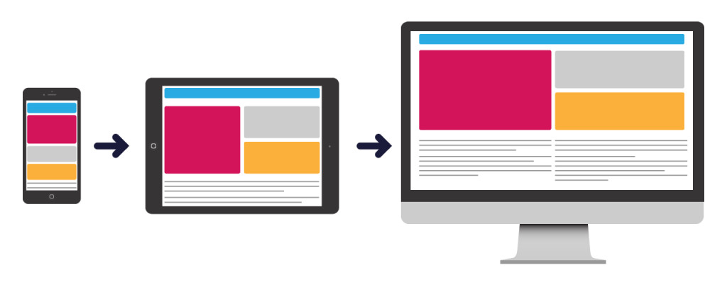
1. Make It Mobile
With 1.2 billion people using their phones for web browsing, you need to make sure your website works on a phone. “Mobile First Web Design” is the practice of starting with the mobile version of a site and designing/building up rather than first imagining how it’ll look on a computer. This puts a responsive mobile site as first priority rather than as a second thought. It also results in a mobile design that isn’t a stripped version of the desktop with less content, and it makes your desktop version pleasantly clean since you couldn’t clutter the mobile version. Whether or not you utilize this practice, your website should always have a user-friendly, mobile version.
2. Use Your Intuition
A website should function as a user expects. When you see a bar at the top of the screen with words like “about” and “contact”, you’re likely going to think it’s a menu bar. Imagine clicking “about” and a video pops up and starts playing with obnoxious music. This isn’t what you were expecting! You were probably expecting to be taken to a new page that starts with something like “About our company”. When it comes to web design, a surprise is rarely good at best and annoyingly confusing at worst. Essentially, place things where it makes sense and have buttons function in a sensible way.
3. Give It Hierarchy
It’s important to have order in your content. This means putting the first thing first and making the title bigger than the paragraph below it. This also means not making every element an attention-grabber or show-stopper. Make sure you’re not overloading your viewer with distracting tidbits or links in your web design.
4. Don’t Fear White Space
White space doesn’t have to literally be white. White space simply lets your eyes rest by not having to focus on text, photos, or other elements. A good example of this is Google. It’s easy to picture their entire homepage in your head because it’s just the logo, a few buttons, and a search bar. White space can also help to create a balanced, effortlessly sleek website and will often happen naturally when you’re using a mobile-first web design. See? They all start to correspond!
5. Explore Cool Typefaces
This point is two-fold. We all should know not to use Comic Sans and Papyrus but you also don’t need to use only Helvetica! A typeface needs to work for your company. Are you a bookshop? Maybe a nice serif font like Mrs Eaves should be your header font. Are you a tech blog? Maybe Brace is a little more for you. Now, you also don’t want your typefaces to work against you. You need a legible font for your body copy. Something like Brace would get tiresome if all of the paragraph copy used it. You also would want to avoid serif fonts for body copy. Sans serifs, like the font you’re using to read this very sentence, are easier on the eye while reading on a screen. Serifs are easier to read in print.
6. Limit Your Typefaces
You were just flying through all the beautiful fonts this world has to offer and you found eight of them you like! Well, too bad. Usually, it’s best if you have one to three different typefaces. Two is the magic number. One for the body copy, and another for other instances like buttons and/or headers. It’s also hard to find three or more complementary fonts whereas there are plenty of lovely font pairings out there.
7. Space Out
Just like it’s hard to read text when it’s too close together, it becomes distracting and hard to read a website when the elements are too close together. Take Yale’s art program website for example. There’s a lot wrong here (remember my white space point?) but let’s look at the space between the posters. There’s no room between some and up to maybe 40 pixels between others. How are you supposed to take that information? If they’re touching, are they together? What’s the difference between a lot of space and just a little? Is there any? Who made these web design choices?
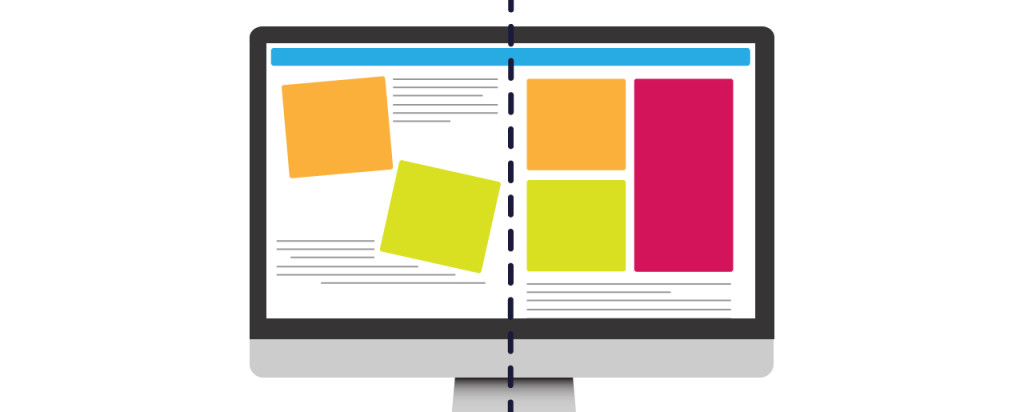
8. Get Gridded
A nice grid is key to web design. It makes elements evenly spaced and well organized. You can use a grid in a traditional sense like in a photo gallery or you can use a grid more liberally. A grid can also be very handy for mobile design since it has much easier stacking abilities.
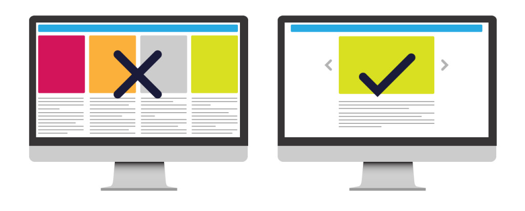
9. Simplify
Keeping your web design simple is important for two reasons. 1) A user coming to your site wants to find information quickly; and 2) a simple design is a good one. Keep the typefaces to a minimum (remember that one?), remember to utilize white space (oh hey!), and don’t try to incorporate too many different design elements. Over-complication leads to messes like a website playing a sound upon clicking (yes, we’ve had someone ask for this feature).
10. Break the Mold!
Since web design is still a creative endeavor, you are allowed to completely disregard the rules as long as it’s done well! Of course, you don’t HAVE to have a menu bar at the top right of the page. But, if you’re going to have it somewhere else, you better have a good reason aesthetically for doing so. You can also break the mold of web design in smaller ways such as using non-traditional icons for elements or by having the header be abnormally large so as to create an interesting focal point. It’s great to not just be another hum-drum website but we encourage a strong grasp on the previous nine tips before disregarding them.
Remember…
Since your website says a lot about you or your company, it’s important to let it speak with your voice. All these design tips are important but they can create a minimalistic, clean, and ultimately generic web design if the voice of the company isn’t being used. In short, speak precisely, speak eloquently, and speak with your own voice.
Web Design With DVS
Your website is accessible to billions of people around the world. Not only should it accurately represent your brand, products, and services, but it should also have a modern and intuitive design. As a full-service agency, our team of in-house web designers and developers create clean and modern websites to help tell your story, connect with your target audience, and stand apart from the competition. Contact us to learn more about our website and design services.
Customized Content for Your Audience
Ready to craft a trade show strategy designed to help you stand out in a crowd and connect with your audience? Let us know how we can help!