There are few things more likely to lose a client’s interest when doing a branding pitch than a conversation about typography. Words like “serif”, “kerning”, and “x-height” are enough to make some wish for the excitement of tax prep or introductory chemistry. But while some of the gritty details hold little appeal outside of the design community, it’s critical to carefully consider elements of typography when defining your brand and recognize how enriching it can and should be. Below are some basic guidelines for non-designers that hopefully provide enough background for you to speak and think critically about your type.
A critical but often daunting task when developing or refreshing your brand is choosing (a) typeface(s) to elevate your identity. With thousands of typefaces available, it can be difficult to know where to start. Here are some good strategies for narrowing down the choices.
Typefaces
That’s right—we’re talking about all those options in the “Fonts” dropdown you scroll through trying to find something unique and cool until finally settling on Arial or Calibri (*shudder*). In this post-moveable type world, “typeface” and “font” have become rather interchangeable terms, and at this point, it’s a distinction without much difference. A typeface describes a family, or style, of fonts. For example, Garamond and Helvetica are typefaces, while Garamond Book and Helvetica Black Italic are fonts.
Each typeface is set apart by its own unique characteristics. Some of these characteristics are purely aesthetic, others serve a very specific purpose.
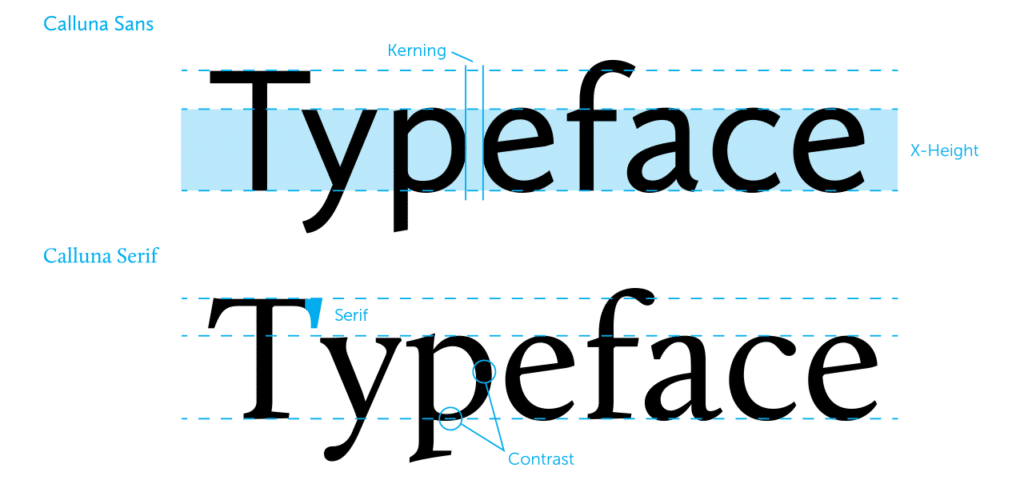
Serifs
Serifs are those little nubs at the end strokes of letters. They evolved from an artifact of rendering letters to a mostly stylistic element, though there are some who argue that typefaces with serifs are easier to read in large blocks of text. Sans-serifs, obviously, don’t have these.
X-Height
X-height is simply the average height of the top of the lower-case set of letters in a font. Not “t” or “l”, but rather the “a” or “o”. A typeface with a taller x-height is highly legible at small sizes, and it also feels a bit more open and friendly. Many modern sans-serifs have taller x-heights.
Contrast
Contrast refers to how much the strokes of the letters vary between horizontal and vertical strokes. Typefaces with higher contrast have a more organic feel, mimicking the pressure and angle of lines drawn with a brush.
These characteristics help each typeface impart subtle information to your audience and can give a broader context to the message you’re trying to communicate. A sans-serif typeface with a very high x-height can have a modern, Art Deco feel. Slap some serifs on it and it becomes more Art Nouveau. Our minds make connections to things we’ve seen in other contexts, so while differences between typefaces may be subtle they can have subliminal effects on your audience’s mood.
Combining Fonts
Now that you’ve started to identify the unique (and sometimes subtle) differences between typefaces, it’s time to consider what will work for your brand. This means considering both the visual messaging as well as the tactical usage of the typeface(s).
Let’s say you’re starting a fashion blog, and you need some fonts with which to make a tasteful cover layout for a summer style lookbook. Your brand is hip and pretty trendy, and you need two fonts to speak to your audience with this voice.
The name of your blog, “Fashion Trendy”, needs to be legible but it’s not the focus of the piece. Popular typefaces these days skew towards geometric, sturdy sans-serifs. Typefaces like Futura (popularized by Wes Anderson), Gotham, and Brandon Grotesque are among some of the most popular on the internet and all have their roots in signage lettering from the early 20th century. To piggyback on this trend while still doing our own thing, let’s set the name of the blog in Avenir, a slightly more modern typeface with similar characteristics and strong, square capital letters. We’ll also give those letters some wide tracking to open it up and make it more of a design element.
For the title of the piece we have some options, so let’s practice font-pairing. We want to avoid being too similar in style to Avenir, and we want to create a sort of balance on the page when both fonts are present. We also want to complement the characteristics of the brand as well as the voice of the piece itself.
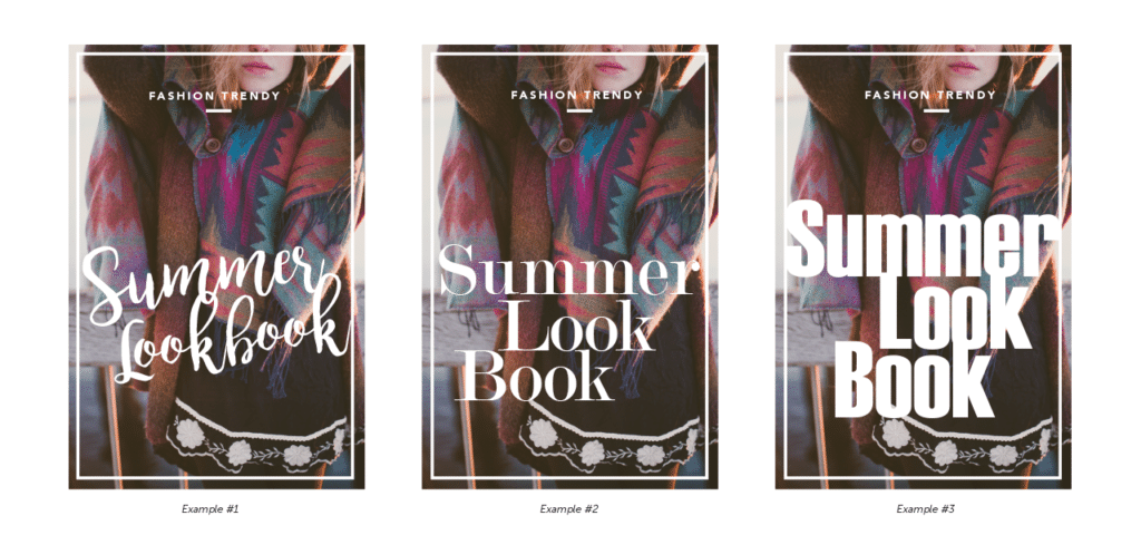
In example one, we contrast the geometric Avenir with a rough brush script font, Bromello. It has a subdued, whimsical energy, and since we’ve set the tracking and leading (horizontal space between lines of text) kind of tight we have nice overlapping and ligatures (connections between letters). This adds visual interest and contrasts the very mechanical strength of the Avenir text.
Example two has a bit more of a classic pairing by using Modern No. 20. This very high-contrast serif is known as a modern or Didone serif and its style has seen lots of use in the world of fashion magazines such as Vogue and Harper’s Bazaar. It echoes some of the structural characteristics of Avenir, using uniformly wide characters that stack well.
Finally, example three shows how a poor font choice negatively affects your design. I’ve chosen Haettenschweiler, the better made older sibling of Impact. It’s very bold. It’s similar to Avenir in all the wrong ways; it’s very bold and heavy, it has a more uniform contrast, and it has no serifs. It weighs the bottom of the page down and feels like someone is yelling at you, or trying to sell you a used car. If we were going for a modern, Andy Warhol kind of feel, this typeface might work with different graphics to create interesting contrast and energy, but in this context, it just doesn’t work.
Logo Design & Branding with DVS
We’ve only just scratched the surface of typography. Type is arguably the basis of modern design, and it plays a tremendous role in branding. At DVS, we use various elements (colors, fonts, logos, messaging) to create brand identities designed to tell your story and form connections with your target audience. Contact us to learn more about developing or improving your brand identity.