Setting a New Direction – Varipro
Brands reboot all the time. They freshen their logo, they tweak their stationery, they launch a new and exciting messaging campaign, etc. But sometimes the hurdles posed by an old brand necessitate a complete top to bottom overhaul.

Project Details
Brand Identity
Name
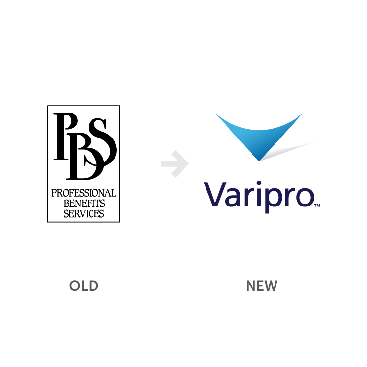
When constructing a new name for Varipro, we started by ideating based on workshops with the client where we identified key characteristics of their company. We used morphology, the study of how words are formed, and a robust list of synonyms to create a short-list of words that had meaning and ‘felt’ comfortable to say. A key part of this process also involved identifying which names coincided with available URLs. The name ‘Varipro’ connected immediately with the client and spoke to their ability to offer variable, professional benefits services.
Logo
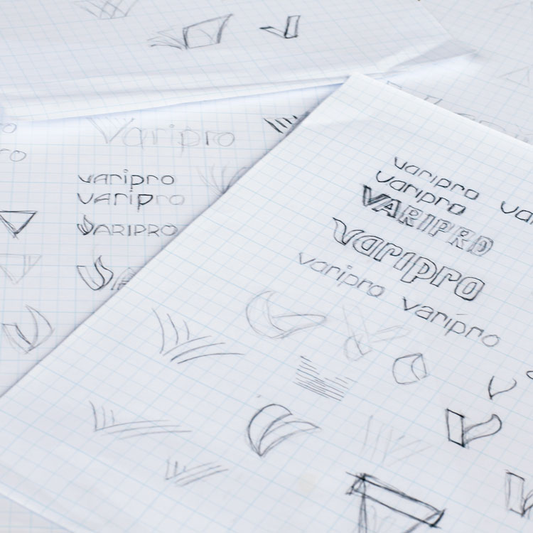
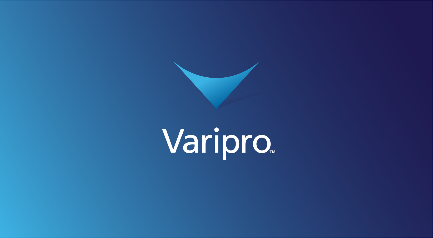
As a part of our initial discussions we identified a wide range of various competitors. In order to create an effective brand identity and logo, we needed to make a brand mark that would sit comfortably within their market while differentiating themselves enough to stand out. After rounds of sketching and presenting a handful of directions to the team, the final concept stood out for its simplicity and flexibility. The mark itself was inspired from mid-century modern design -it’s simple, geometric, and balanced. It evokes a sense of accuracy standing on the fulcrum of a stylized “V”.
The final direction uses a simple mark that symbolizes several things – precision, flexibility, balance, and of course the letter “V”. It’s also a nod to the mid-century modern design that West Michigan is known for, giving the company an implicit sense of place. For the logotype we used a gently tweaked Frutiger, carefully kerning the letters and smoothing some of the small details (like rounding the dot over the “i”). The deep indigo color is rich and corporate and offsets the bright blue mark nicely.
As with all our logo design / rebrand projects, we provided clear documentation on how to use the brand materials, in the form of a Brand Standards Guide.
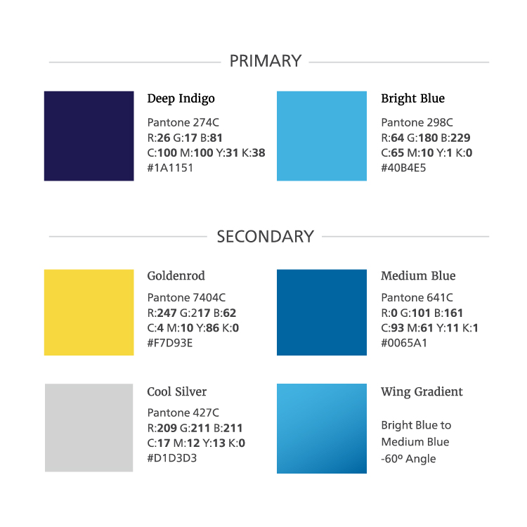
Color
Color was an important sticking point from the client’s perspective because there were specific competitors they wanted to skew away from. The primary brand color is a deep indigo, complimented by a brighter blue gradient. This dark blue feels comfortable and professional, while the brighter blue accents give things an energetic pop.
Website
A key part of our strategy involves driving traffic to the Varipro website to build awareness of the new brand. To do this we built a site that places an emphasis on content and accessibility. We identified four main user personas; agents, employers, members, and providers. From this we built a home page that presents users with 4 clear portals to landing pages customized to each persona.
Marketing Strategy
Our strategy for the new Varipro brand is two-pronged. In the short term, our goal is to build awareness of the Varipro brand within their market using inbound marketing strategies. The long-term strategy involves establishing Varipro as the leader in their industry by positioning them as an educational resource. Both of these strategies rely heavily on creating and disseminating unique content.
Before diving into content creation, we needed to define some basic messaging and tone for the Varipro brand. We developed the tagline “Smart About Benefits” as a baseline for not only establishing our client as a knowledge source on third party benefits administrations but also as an implied promise that by working with Varipro you also will become “Smart About Benefits.” From this collaborative ideal we decided on a direct, informal tone for the voice of the content.
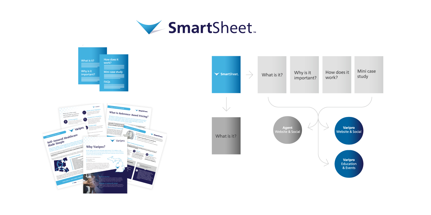
From this followed the concept of the Smartsheet, a way to present robust content that answers basic questions about aspects of third party administration of health benefits. Since insurance agents represent a large part of their sales funnel, Smartsheets function as a non-branded way to help agents talk to their clients about third party administration. This establishes Varipro as a trusted and preferred partner. We then take content from the Smartsheets and create pages on the website, which seeds Google with authoritative information. The social media strategy involves targeting LinkedIn and Facebook with blog articles from the website and relevant links to content elsewhere on the web.
Results
Our marketing efforts have yielded positive results for the new Varipro. Since launch we have seen strong regional ranking in Google search results for “third party administrators” and related keywords. On the ground, the Smartsheets have generated buzz and appreciation amongst insurance agents. Click through rates for posts and pages featuring the Smartsheet content see higher than average click-through rates in placed advertisements.
Since the rebrand and new marketing strategy, Varipro has expanded significantly, aquiring two smaller benefits administration firms near Detroit.