Branding That Nails It – Irish Roofing
Irish Roofing & Exteriors approached us with a daunting task; establish a strong, modern brand and voice that would help them as a start-up stand out in a heavily competitive, price-focused industry. We delivered a website and messaging that would drive customers to action and a bold, refined brand to carry them into the future.
Brand Messaging
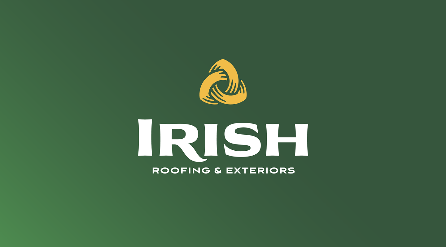
When we first met with Irish Roofing, all they had was a name. In order to flesh out their brand we dug into what the name Irish signified for them, what it might signify for their clients, and how we could use it to set them apart from a fairly crowded field of competitors. We identified client personas that spoke to a sense of pride in home ownership and a desire for investment. These clients place high value on customer service and quality product, of forming a relationship with a company. From here we came up with the tagline “Craftsmen, Not Contractors” as a way to introduce Irish to the community and set them apart from much of their budget-focused competition.
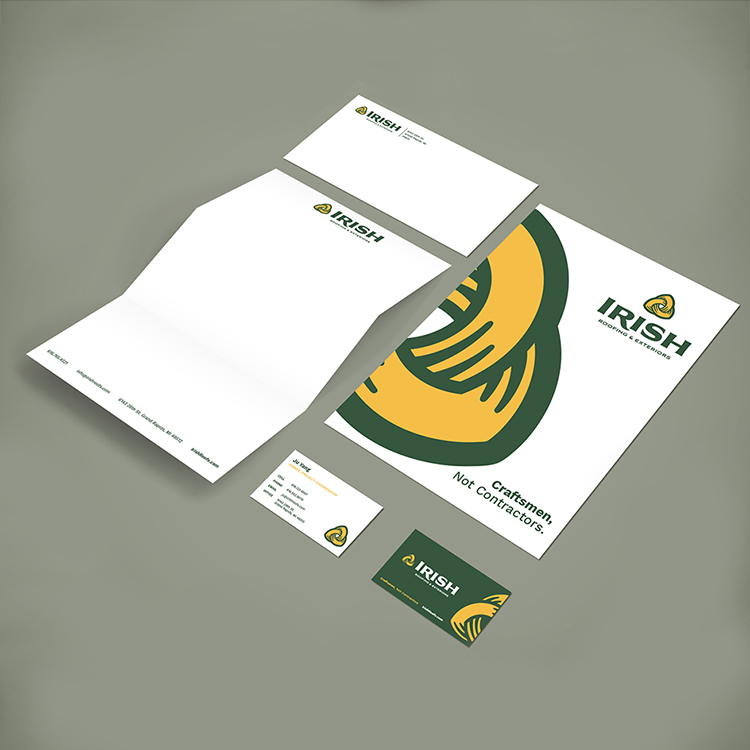
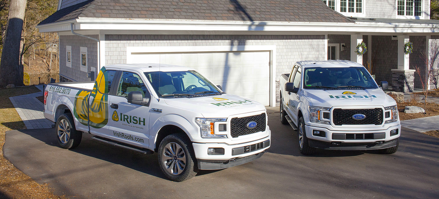
Visual Branding
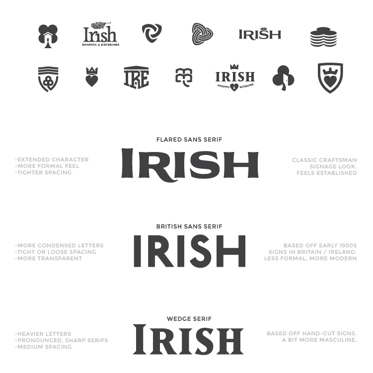
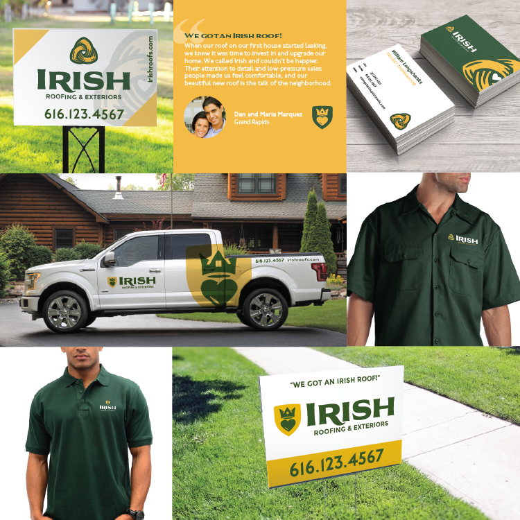
Once the story and goals of Irish were established, we set to work creating a visual brand that spoke to their values and the values of their desired clients. The goal was to create a logo mark that would be easily identifiable when used in signage, from yard signs to billboards to truck graphics. As always this started with research and sketching logo ideas. We presented digitized versions of these ideas over a couple of rounds of client meetings to hone in on two solid concepts. Once established, we worked each concept through many variations of type and color for a final presentation.
Website
As part of the branding process we created a modern looking website for Irish that allowed for growth, easy management, and content publishing. As with many of our sites we leveraged the WordPress platform for ease of content management and robust development community. The site reflects the company values and serves as a professional, search-optimized introduction to the company.