1. Visual Hierarchy
When I began designing for the web, ‘skeuomorphism’ was quite the rage. Shiny buttons, photorealistic textures, oversized icons that were basically full-fledged illustrations, beveled borders around everything – you get the picture. The problem you’d often see revolved around clutter. Colorful illustrations and buttons that took hours to get juuuuust right look great on their own, but all too quickly users can become distracted or confused about where to go, what to click, etc. Go overboard with your flat design and users might not know what a clickable link is and what isn’t. Go too crazy with super stylized buttons and you might give users pause as they wonder which to click next.

Skeuomorphism gone wrong.
It’s important to prioritize your content on the page and use size, color, and images carefully to create a visual hierarchy. The latest web design trend with a lot of flat websites is to go very, very minimal with styling. While I LOVE minimal design, it’s easy to fall into the trap of making things harder to use. If you’re trying to be super hip and minimal, and use all blue text on a white page, you’re really making the user concentrate on where they’ll go next and what can be clicked. Something as simple as making link colors a complementary or contrasting color to the predominant color of the site goes a long way to promoting good wayfinding and build confidence for the user.
2. Good Typography
Typography is one of the strongest tools in a designer’s arsenal. Knowing how to choose typefaces to compliment your layout and building a system to define heading sizes, gutters, and columns for your design is critical to help establish your visual hierarchy. Remember that content has to come first, and a strong typographical layout is the framework upon which you can build. It can be tempting to jump on the bandwagon of something like a fluid layout to make a site respond to any screen size, but if you have lots of content a strong grid system will make your page much more readable.
One of the great things nowadays are the tools that make practically any font available for use on the web. Services like Typekit and Google Fonts can integrate seamlessly with any framework, and their selection of typefaces grows practically daily. Always keep usability in mind when choosing fonts – trendy thin fonts look real cool but often have legibility problems on different devices, and using too many different fonts on a page is both confusing and ugly.
3. Less Is More
As years go by, more and more things become possible when designing websites. Advancements in code and browser compatibility mean we can do fun things like CSS transitions, video hero images, responsive designs and single page scrolling explosions of parallax insanity. But, to paraphrase Dr. Ian Malcom, designers can be “so preoccupied with whether or not they can, they don’t stop to think if they should.” One should look at designing sort of like cooking; web design trends are like spices you add to classic recipes like minimalism. You want to find balance. Adding trendy things like parallax scrolling or CSS animations can be great if used carefully to enhance the content. Too many animations, too much stylized text, or too many super fancy buttons have been shown to reduce user interaction. Things can get confusing for some, not work right for others, or even seem like they’re not even a part of the site.
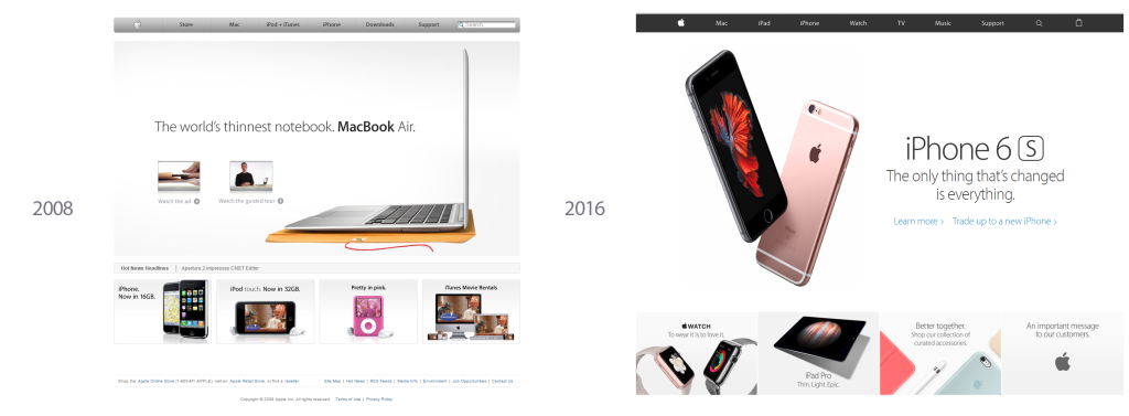
Solid design principles lead Apple’s site through skeuomorphism and flat design.
4. Use Patterns
A pattern is a UX term that describes a common way for doing things. We find as we design multiple permutations of things like contact forms, shopping carts, or login screens that layout and functionality becomes optimized and, in effect, standardized. Users expect them to work the same from one site to the other. It can be tempting to apply the new cool minimalist flat styling to your company’s contact form, but you need to be careful to not obscure the basic functionality that users expect. Being clear with your design elements and giving users visual hints about function and direction builds confidence, an important goal in making your site usable.

There’s a lot going on here, Windows…
Designers need to possess a healthy sense of skepticism. When trying to keep web designs beautiful, usable, and durable, there needs to be a good balance between the cool new web design trend and solid design techniques. Hopefully, it will help your next website redesign remain relevant for at least 3 months.